Designing Intuitive Dashboards for Stock Trading Apps
 Next Olive
17 Sep, 2025
12 mins read
28
Next Olive
17 Sep, 2025
12 mins read
28
Introduction
When we talk about stock trading app development, the conversation often turns to security, speed, and compliance. These elements are critical, but one of the most overlooked aspects of creating a successful product is the design of the dashboard. A dashboard is the heart of the user experience, the space where traders spend most of their time, and the first point of contact between human decision-making and financial data. A poorly designed dashboard can overwhelm and confuse users, while an intuitive one can empower them to make confident trading decisions.
Stock trading app development is not just about coding features or integrating APIs. It is about understanding how users interact with data and ensuring that the dashboard is clear, functional, and engaging. Whether your audience consists of beginners who need guidance or seasoned traders who crave advanced tools, dashboard design can make or break the app’s adoption rate.
This blog will explore how to design dashboards that resonate with users, build trust, and improve overall trading performance. We will cover fundamental design principles, the psychology of user behavior, strategies for structuring complex data, and examples of features that traders find valuable. Along the way, you will see how the right dashboard approach can enhance the entire stock trading app development journey.
Why Dashboards Matter in Trading Apps
A stock trading app dashboard is not just a screen with numbers and charts. It is the command center. Every action a trader takes—placing an order, checking their portfolio, analyzing price movements—begins here. Because of this, dashboard design has a direct impact on how users perceive the app.
An intuitive dashboard builds trust. When traders can easily access the information they need, they feel more confident in making trades. On the other hand, a cluttered or poorly organized interface leads to frustration and mistakes. Since financial decisions involve risk, users are quick to abandon apps that do not provide clarity.
The dashboard also serves as a reflection of the app’s brand. If the dashboard feels modern, responsive, and carefully designed, users assume the underlying technology is equally robust. In short, the dashboard is not just a feature. It is the product.
Principles of Intuitive Dashboard Design
Creating an effective dashboard requires a balance between simplicity and depth. Traders need access to vast amounts of data, but the information must be presented in a way that is easy to scan and interpret. Several principles guide intuitive dashboard design:
1. Clarity Over Complexity
Traders often work under time pressure. A good dashboard removes noise and highlights what matters most. Information hierarchy plays a critical role. Use typography, color, and spacing to emphasize key metrics like portfolio value, available balance, and market trends.
2. Consistency Across Views
Consistency ensures that users do not waste cognitive effort re-learning patterns as they navigate. Buttons, filters, and data visualizations should work the same way across different sections. A consistent dashboard minimizes user error and creates a seamless experience.
3. Contextual Data Presentation
Numbers without context are meaningless. Instead of showing raw figures, provide comparisons, percentages, or historical trends. For example, a stock price should be displayed with both its daily change and a quick view of the past week’s performance.
4. Real-Time Responsiveness
Stock markets move fast, and dashboards must keep up. Data should refresh in real time without lag. Even small delays create doubt in users’ minds. Smooth transitions and responsive updates foster trust in the app.
5. Personalization Options
Not every trader has the same goals. A novice might prioritize educational content and simple charts, while an experienced trader may want technical indicators and order book data. Offering customizable dashboards ensures the app remains useful across skill levels.
The Psychology Behind Dashboard Design
To design dashboards that feel natural, it helps to understand how people process information. Human brains prefer visual patterns over raw data. That is why charts, icons, and heat maps often communicate better than tables of numbers.
Another psychological factor is cognitive load. Users can only process so much information at once. A dashboard that bombards them with too many widgets causes fatigue. The solution is progressive disclosure: show essential information up front, and allow users to dive deeper when needed.
Trust is also psychological. When users see clean layouts, intuitive navigation, and responsive features, they subconsciously feel that the app is reliable. This is vital in trading, where money is at stake and small design flaws can trigger doubt.
Structuring the Dashboard for Stock Traders
A trading dashboard typically includes several core elements:
- Portfolio Overview: A summary of current holdings, total value, and performance.
- Market Watchlist: A customizable list of stocks or assets the user tracks regularly.
- Trading Tools: Quick access to buy, sell, and order management functions.
- News and Insights: Relevant headlines and analysis to support decision-making.
- Notifications and Alerts: Signals for price changes, order executions, or market news.
The challenge lies in presenting these components without overwhelming users. A grid-based layout often works best, with the most critical information placed at the top or center of the screen. Supporting details can occupy side panels or collapsible sections.
Typography and color use also influence structure. High-contrast colors highlight gains and losses, while clean fonts make data easier to scan. Proper white space reduces clutter and gives the dashboard a breathable look.
Designing for Beginners and Experts
One of the complexities in stock trading app development is that the user base is diverse. Beginners and experts have very different needs. A single dashboard must cater to both without alienating either.
For beginners, simplicity is key. They need clear portfolio summaries, simplified trading options, and educational hints. For experts, the dashboard must offer technical charts, indicators, and real-time depth of market data. The best approach is a tiered design that allows customization. Users can start with a basic dashboard and add advanced widgets as they grow more comfortable.
Visualizations That Work
Charts and graphs are the backbone of trading dashboards. The challenge is to present them in ways that are both informative and accessible. Line charts work well for tracking trends, bar charts for volume, and candlestick charts for technical analysis. The key is to avoid cluttering the screen with too many indicators.
Interactive elements add value. Allow users to zoom in, hover for details, or toggle different timeframes. These interactions make data exploration engaging without overwhelming the default view.
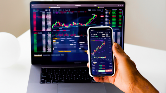
Mobile-First Design for On-the-Go Traders
Many traders today use mobile devices as their primary tool. This means dashboards must be optimized for smaller screens. Responsive layouts, collapsible menus, and touch-friendly interactions are essential.
The mobile dashboard should prioritize speed and clarity. Key actions like buying and selling must be easily accessible with minimal taps. At the same time, users should still be able to access deeper analytics when needed. Designing for mobile does not mean stripping features but adapting them to a compact, intuitive format.
Security and Trust in Dashboard Design
Since dashboards handle sensitive financial data, design must integrate security seamlessly. Two-factor authentication, secure data encryption, and visible confirmation messages help reassure users. A dashboard that communicates security effectively encourages long-term trust.
Security should never feel intrusive. Instead, it should be integrated smoothly into the workflow, ensuring that protection does not come at the expense of user experience.
Testing and Iteration
No dashboard design is perfect from the start. Continuous testing with real users is essential. Observing how traders interact with the dashboard reveals pain points that designers may overlook. A/B testing different layouts or features helps identify what works best.
Iteration is part of the culture of stock trading app development. Just as markets evolve, so must dashboards. Ongoing updates keep the app relevant and aligned with user expectations.
The Future of Trading Dashboards
Looking ahead, dashboards will become more intelligent and personalized. Artificial intelligence can provide predictive insights, while machine learning can suggest actions based on trading patterns. Voice commands and conversational interfaces may also play a role, making dashboards even more intuitive.
At the same time, simplicity will remain the guiding principle. As technology adds complexity, the role of design will be to filter and organize information so users are not overwhelmed. The goal is always to make trading feel manageable and empowering.
Conclusion
Designing intuitive dashboards is one of the most critical aspects of building successful trading platforms. A well-structured dashboard reduces cognitive load, builds trust, and helps users make confident decisions. By focusing on clarity, personalization, visual design, and continuous testing, developers can create experiences that stand out in a competitive market.
In the world of stock trading app development, dashboards are not just a feature but the core of the entire user experience. They shape how traders interact with markets, how they perceive risk, and how much they trust the platform. As technology and markets evolve, intuitive dashboard design will remain the bridge between human decision-making and complex financial data. By prioritizing thoughtful dashboard design, companies can deliver apps that traders not only use but also rely on every single day.
Stock trading app development continues to evolve, but one truth remains constant: the dashboard is where everything comes together. A clear, responsive, and user-focused dashboard is the key to transforming financial data into actionable insights and building lasting trust with users.
Written By:
Next Olive

Hotels at your convenience
Now choose your stay according to your preference. From finding a place for your dream destination or a mere weekend getaway to business accommodations or brief stay, we have got you covered. Explore hotels as per your mood.